Examine user paths for joining a rewards program
The ask
- Capture a rewards program's ecosystem across mobile, email, desktop, and in-store experiences.
- Pay specific attention to the new member experience across these different channels.
- Look for opportunities for improvement and make recommendations.
The challenges
- No access to client data, client insights, or user interviews.
- Summarize and compile findings in a document for client-facing individual to present.
- Update an outdated document from a previous designer.
My process
I started this project with a multi-paged document from previous designer. That document inventoried the rewards program’s ecosystem and outlined various processes that users might engage with. My initial role was simply to update screenshots for elements that had changed online or in-app. This seemed relatively straightforward as I used the document to guide me through processes and look for new content.
As I dug deeper into the client's ecosystem, I began to see a disconnect from what was being recorded and what it was attempting to show. The document, when describing a process, was heavy on large screenshots that made the process itself hard to follow.
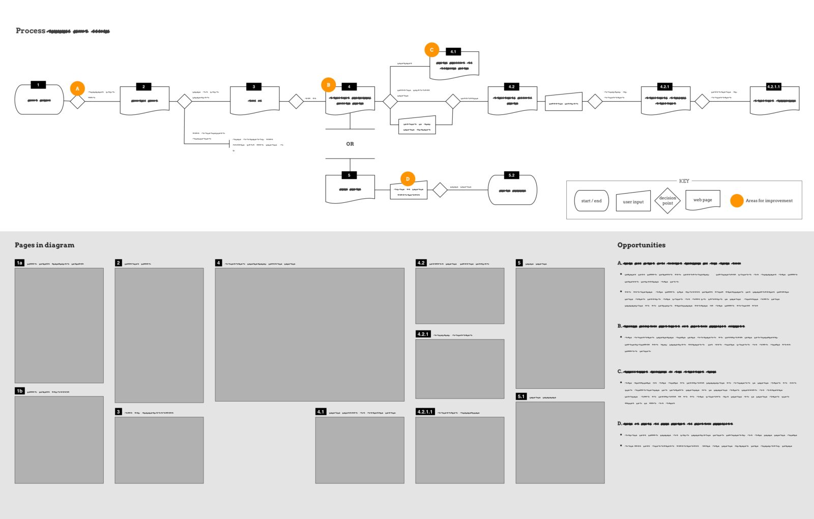
To make this more clear, I removed the screenshots from the processes and redesigned each with standard workflow symbols and clear labels. This moved the document’s focus away from representing visual problems and instead to illustrating system-based problems. These new diagrams showed potential friction points due to confusing messaging, circular navigation that didn't resolve consistently, and user join processes that left much to be desired.
This discovery process necessitated a deep dive into the client's ecosystem, where I made new accounts across multiple surfaces with varying conditions. Addressing the system from so many angles allowed me to simulate key actions that potential new members might also use to engage with in the system. While doing this, I critically assessed the new member experience in terms of ease of use, clarity, consistency, messaging, predictability, and reliability. Where problems were found, I noted my path and experience. These initial notes formed my findings and recommendations.
I documented everything I did in the system, sketching diagrams on paper, while recording screenshots of the pages, screens, and emails that I engaged with. These became accessory material to the user flows. As recommendations crystallized, these were also marked on the user flows and written in plain language on the page.
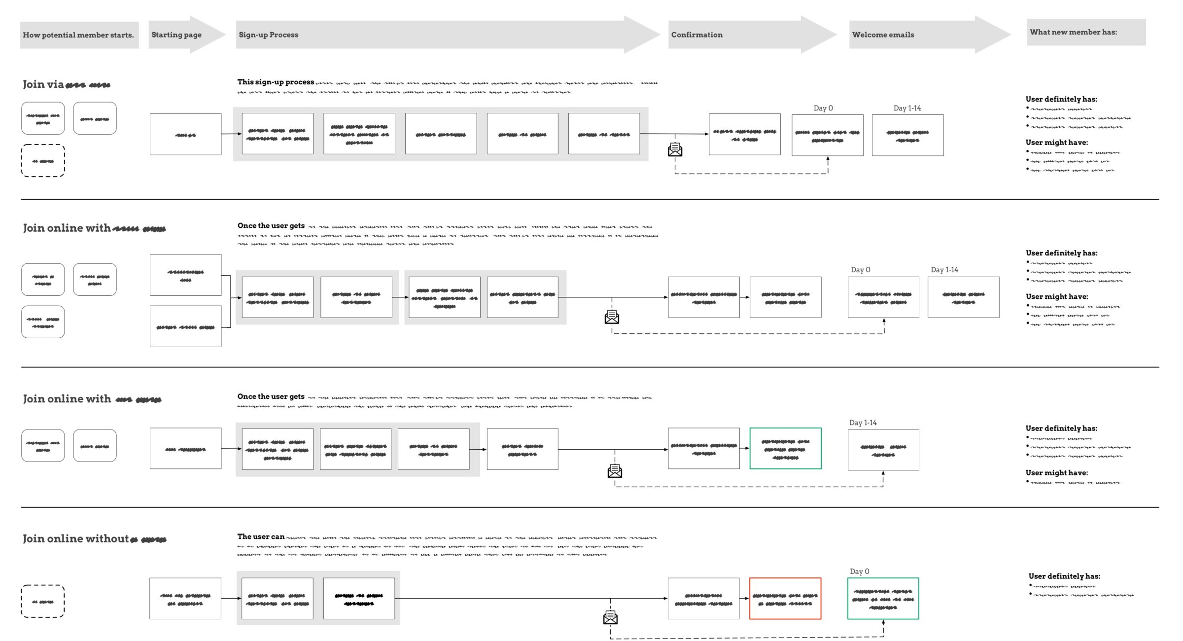
I uncovered a number of points in the acquisition journey that did not support successful account creation. Depending on how I joined the program -- by app or website, with or without a physical object -- I did not always become a member. I placed all of these join processes in a single diagram to quickly contrast why some were highly efficient and successful while others resulted in frustration.
As a result of this work, I was invited to present and discuss the comparison diagram and user journeys with the potential client.
Summary
This expert review revealed inconsistencies and potential points of failure that users might experience when signing up as new members. It recorded a baseline for how a system currently worked along with problem areas that could be tested with live users. Given the opportunity, this discovery work could underpin a user research study into how users move throughout the ecosystem while capturing their goals, expectations, and experiences.


