Evaluate the usability of a ukulele website
For this example project, I evaluated an existing website and recommended usability improvements.
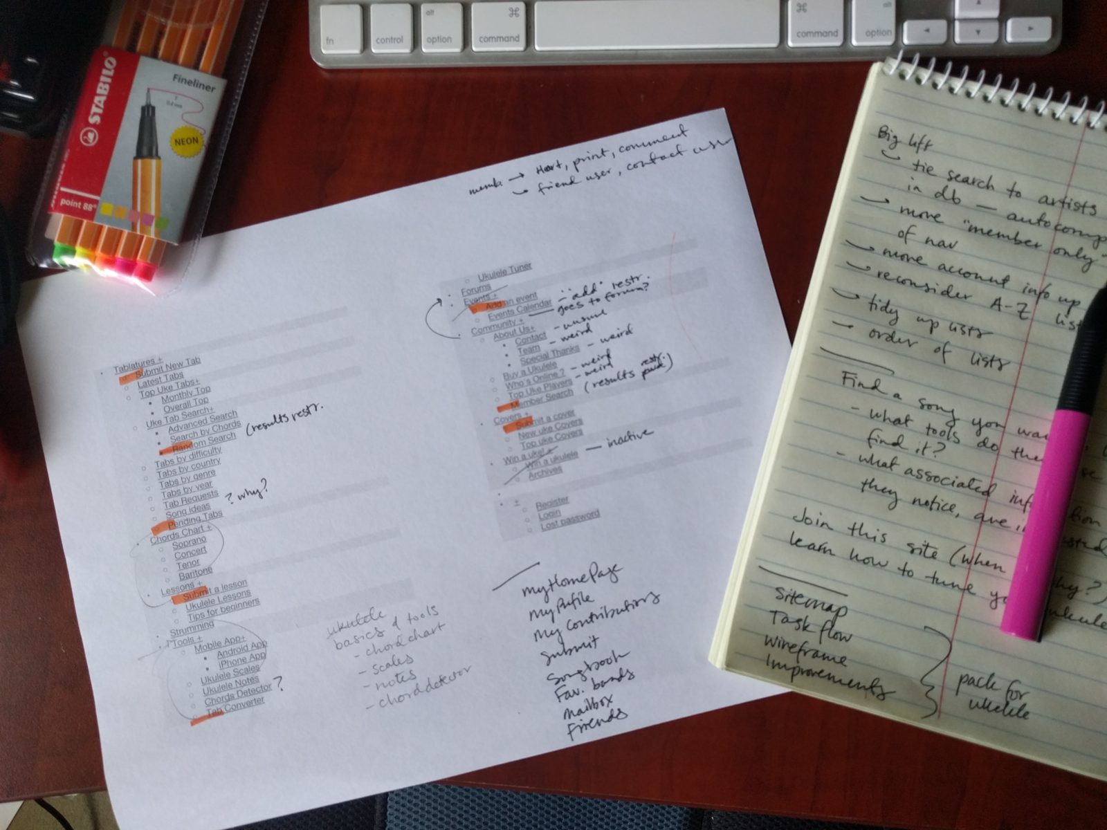
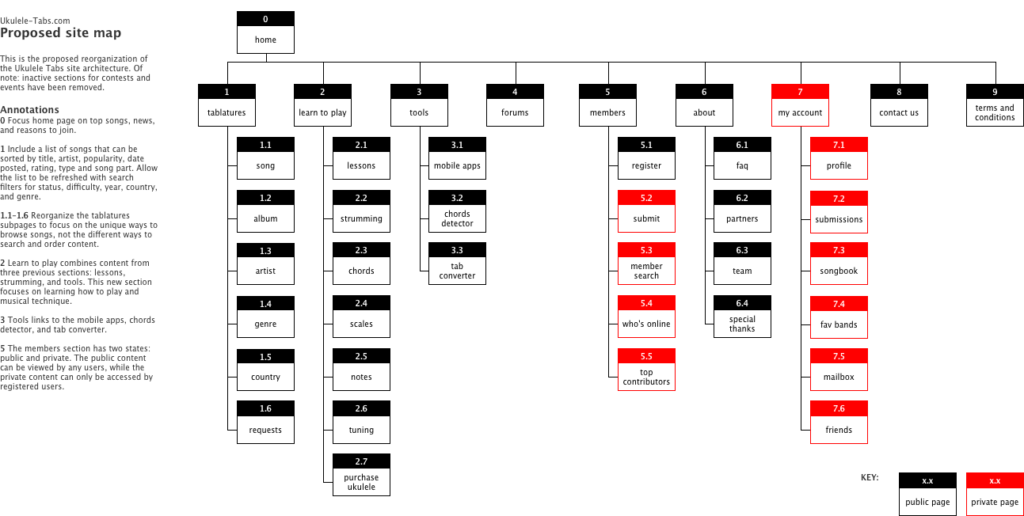
I used an outline of the current navigation structure as a checklist to look for site elements that were unclear, out of use, or irrelevant to non-members.
I created a new site architecture and navigation schema to target new users and players.
While I was evaluating the site architecture, I also skimmed through all major page types and looked for opportunities that would create the biggest improvement to the site's usability.
I made a running list of things the site did well and things that were major problems.
Things the site did well:
- Robust library of music categorized by artist, country, genre, album, and year
- Full lyrics available for signed-in members
- Relevant chord diagrams included per song
- Members can submit and review songs
Major problems:
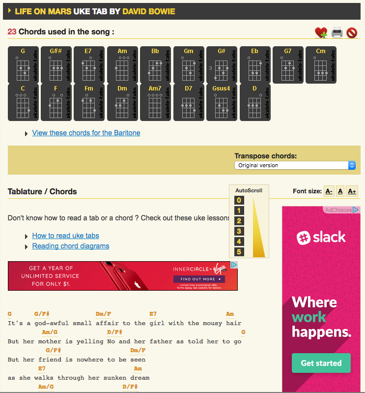
- Heavy ad-sponsorship covers up important content
- Song pages difficult to use while strumming
- Icon behaviors are unclear
- Content is error-prone, dependent on members to find and correct problems
- Registration form asks for too much non-essential information
Since the song pages were the core of the site, I focused on improving that first.
Song page functionality
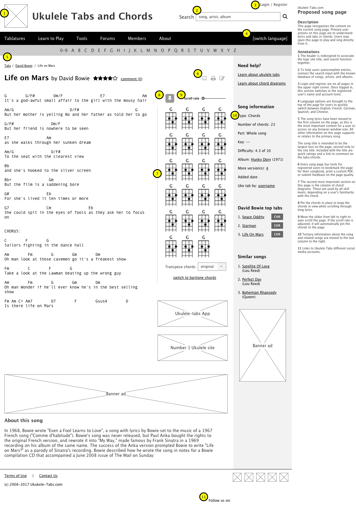
The song pages had song chord diagrams in a horizontal stripe at the top of the page. Song lyrics were further down the page in a vertical column. The two parts of the page were difficult to use together because scrolling down to see the lyrics meant losing sight of the different chord formations. For players that need chord diagrams, it would be difficult to read the song and play the right chord at the same time.
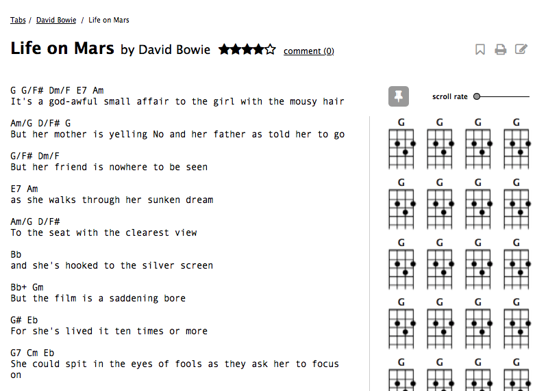
The simplest solution to improve this was to place the chords in a column to the right of the lyrics. This column would be wide enough to accommodate a set of chords without requiring scrolling. As the user scrolled vertically down the page, the chords would be pinned in place and always visible.
Song page information hierarchy
The core activity on the song page is to read lyrics and chords. All other items would be subordinate to this, decreasing in importance from song tools (like transposing chords) to song categorization (artist, song, and album) to similar songs. Meta information such as song type, part, difficulty, and versions would be worked into the UI in a meaningful way.
Summary
This was based on my experience with the Ukulele Tabs site and skewed towards my point of view as a new user/player. To conduct a more robust and less biased evaluation of this site, users of different types could be recruited from the site for interviews and usability tests. User tasks for learning new music and instruments could also be gathered from discussions on music forums.

